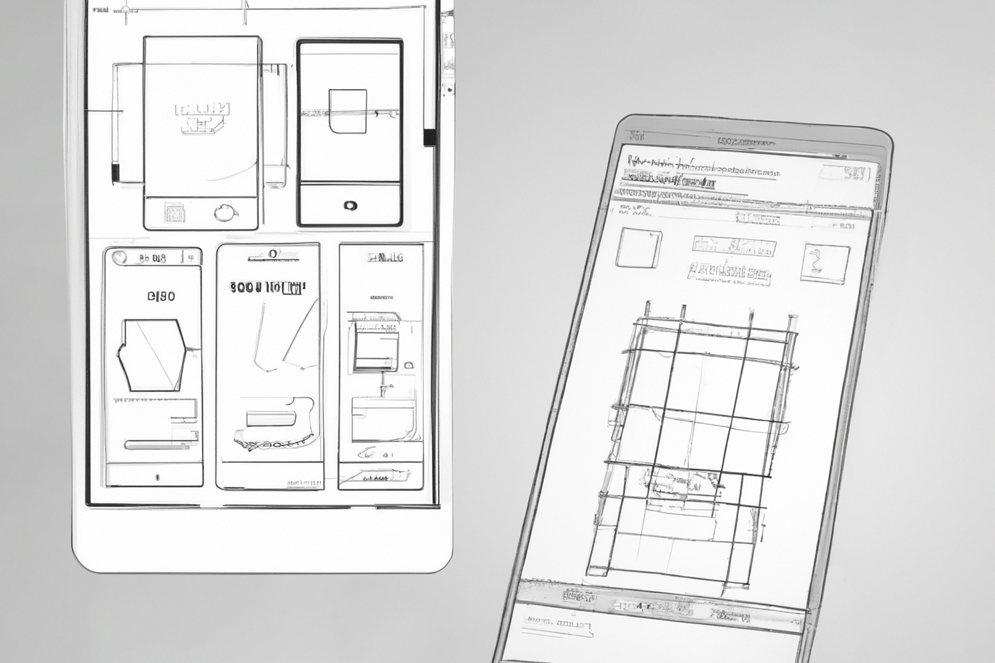
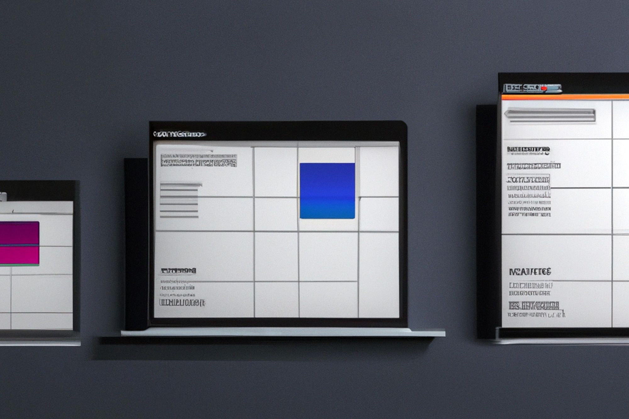
What is responsive design?
Of the Starting point of responsive design or responsive web design (RWD) it is, different windows and screen sizes in all display sizes on different devices (PC, Tablet, Smartphone, TV, etc.) adjusted to display, by one user-friendly operation to accomplish. Responsive web design provides the current design standard for websites. The flexible display on different end devices also promotes the user experience (UX) . With responsive web design, there is different implementation approaches: For example, if a website is designed for mobile devices first, this approach follows the concept of "mobile first".

Do I need a responsive design?
At the present time there is one Web presence without responsive design is no longer up-to-date and should definitely be adjusted or even re-planned accordingly. Our team has been implementing responsive designs for our customers for many years. Nevertheless, he is Implementation effort a responsive design not to underestimate and good planning in advance saves effort and costs. However, the advantages of responsiveness are obvious:
- Attractive and clear presentation of content on all end devices
- The User experience is through the many different representations on the many different devices from an SEO point of view ( search engine optimization ) in advantage, since mobile devices often through well implemented responsive design, the Influence ranking positively, because users browse longer on them than, for example, on a normal PC. At the latest after the introduction of Google's "Core Web Vitals", a lack of responsive web design leads to a clear drop in performance.
- It is contemporary and reduces the bounce rate (bounce rate) of potential visitors to the website
- SEO and technology changes can be made in a few files take place, thus saving time and effort
- Usability is hardly restricted

Are there alternatives to responsive design?
In addition to a responsive web design, there is also the Alternative to create a self-sufficient mobile website, which is implemented, for example, via a subdomain. However, the effort for an independent mobile web presence is significantly higher than it is on a responsive site. Likewise, must SEO adjustments additionally implemented will, the same applies to changes in appearance or technology the standalone mobile website.
Responsive design in practice
The Implementation of a responsive web design by means of so-called "Media Queries" (commands and definition areas within a programming/scripting language) held in the Programming languages "HTML5" and "CSS3"“ be stored accordingly. Now if one End device accesses a website, indicates the appropriate "Media Query" the information to be delivered. This means that the same page is displayed on every end device in different resolutions perfect fit played out. A big SEO Advantage enjoys the responsive design in relation to the one already mentioned Mobile-first approach. Background is that Google has implemented mobile-first indexing since February 2021 and thus Separation of mobile and regular desktop content tracked in indexing.

Conclusion
In our opinion, nowadays no website without a responsive or alternatively mobile design. The benefits are clear and should be used to the fullest to achieve the full Website potential can be guaranteed. Our team by technical, design and SEO experts stands by Any questions or requests available.
In October 2020, Google presented its product Google Analytics 4, "GA4" for short . It represents a new version of the already known Google Analytics Universal . On March 16, 2022, Google announced in a clear statement that users of Google Analytics Universal must switch to the new version of Google Analytics, since Google Analytics Universal will no longer be available from July 2023 Will be available. It is therefore a good idea to consider running Google Analytics Universal and Google Analytics 4 (GA4) in parallel to become familiar with the changes and benefits of GA4 .


