Aunt Emma24

Short profile of TanteEmma24
TanteEmma24 is always available for night owls, pupils, students, children, pensioners on the move and of course for all other people who need a thirst quencher, a snack or high-quality food at any time, quickly and independently. TanteEmma24 provides an extensive range of food vending machines, including: drinks, sweets, ice cream, various meat products and snacks.
Brand identity
During the entire design process, the focus of the brand design was the warm and cordial memory of the corner shops, which were so valued then and still are today, where shopping merges with feel-good factors. Particular attention has been paid to the customer's keywords, combining retro style with modernity, but at the same time reflecting the warmth and security of the "good old days".
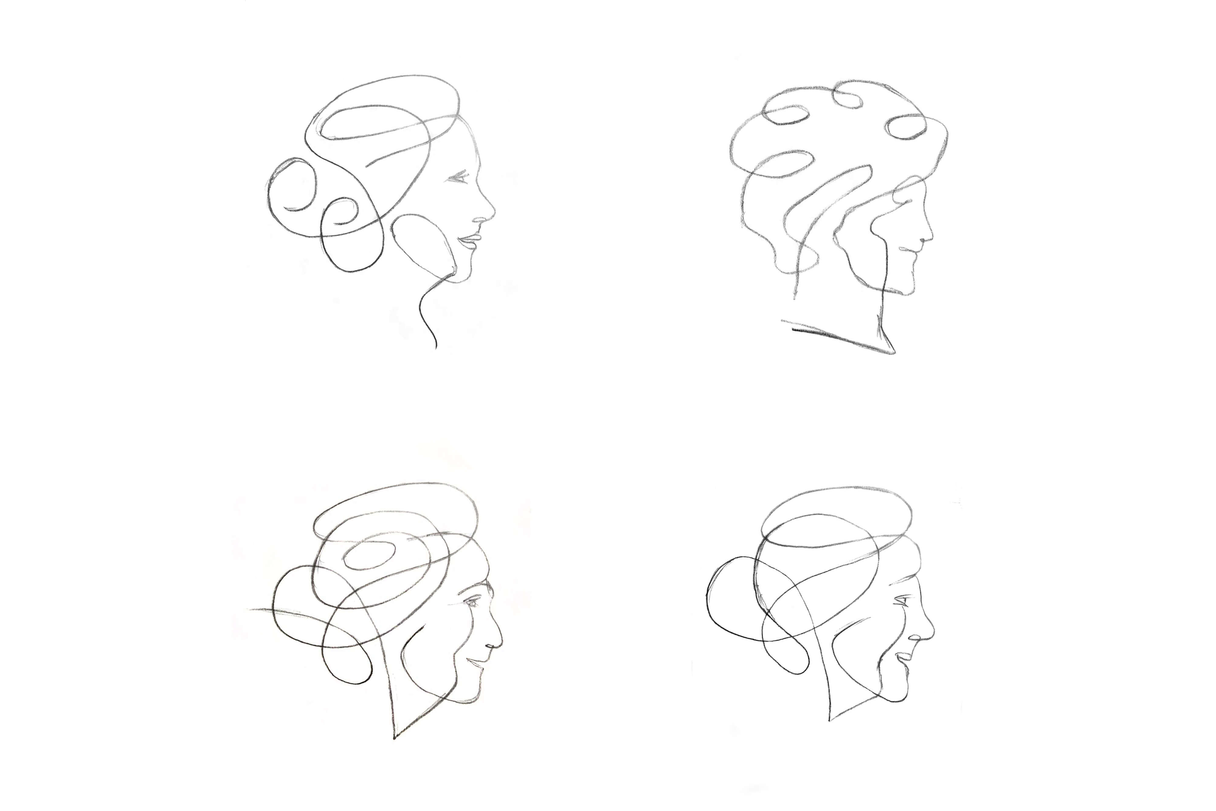
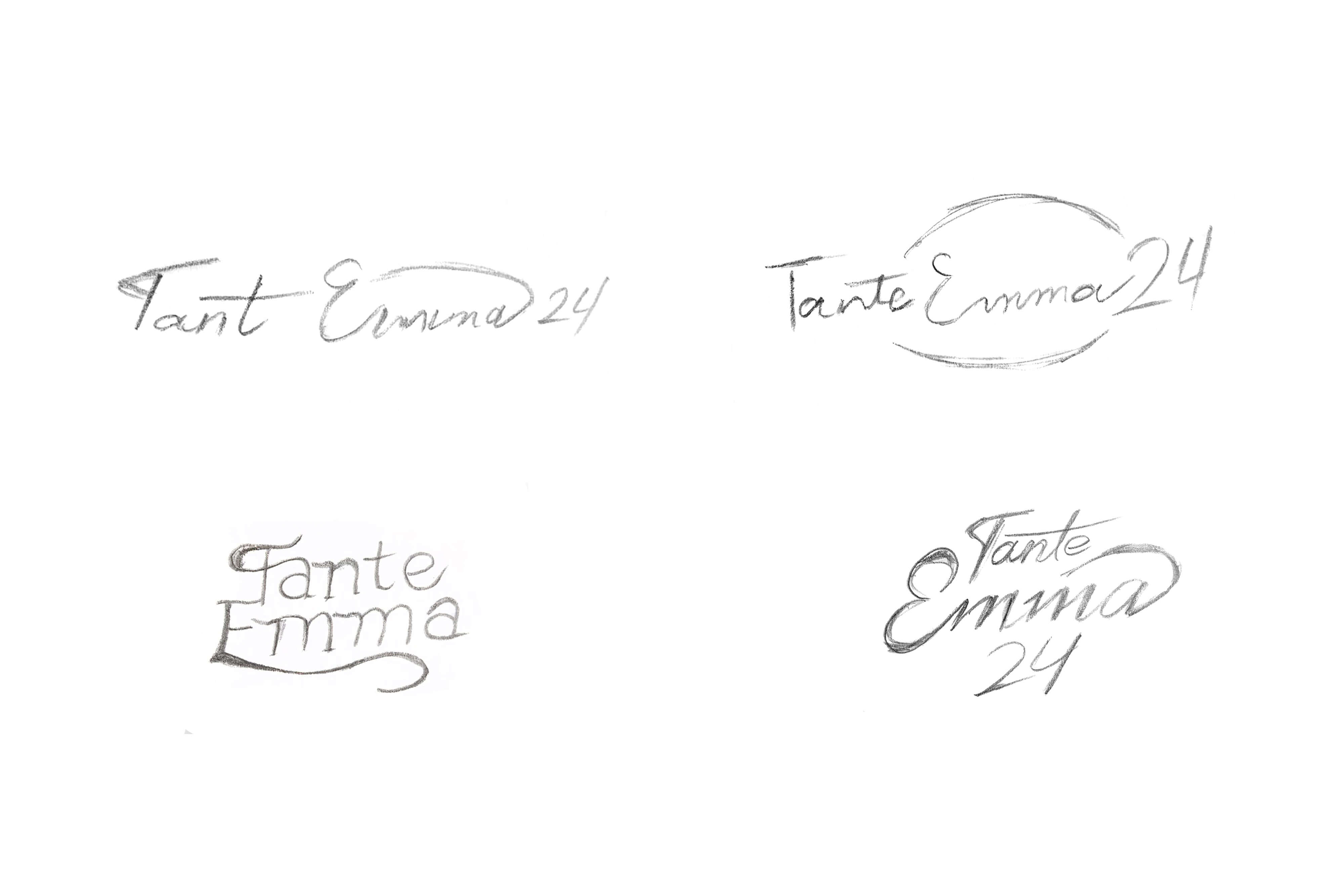
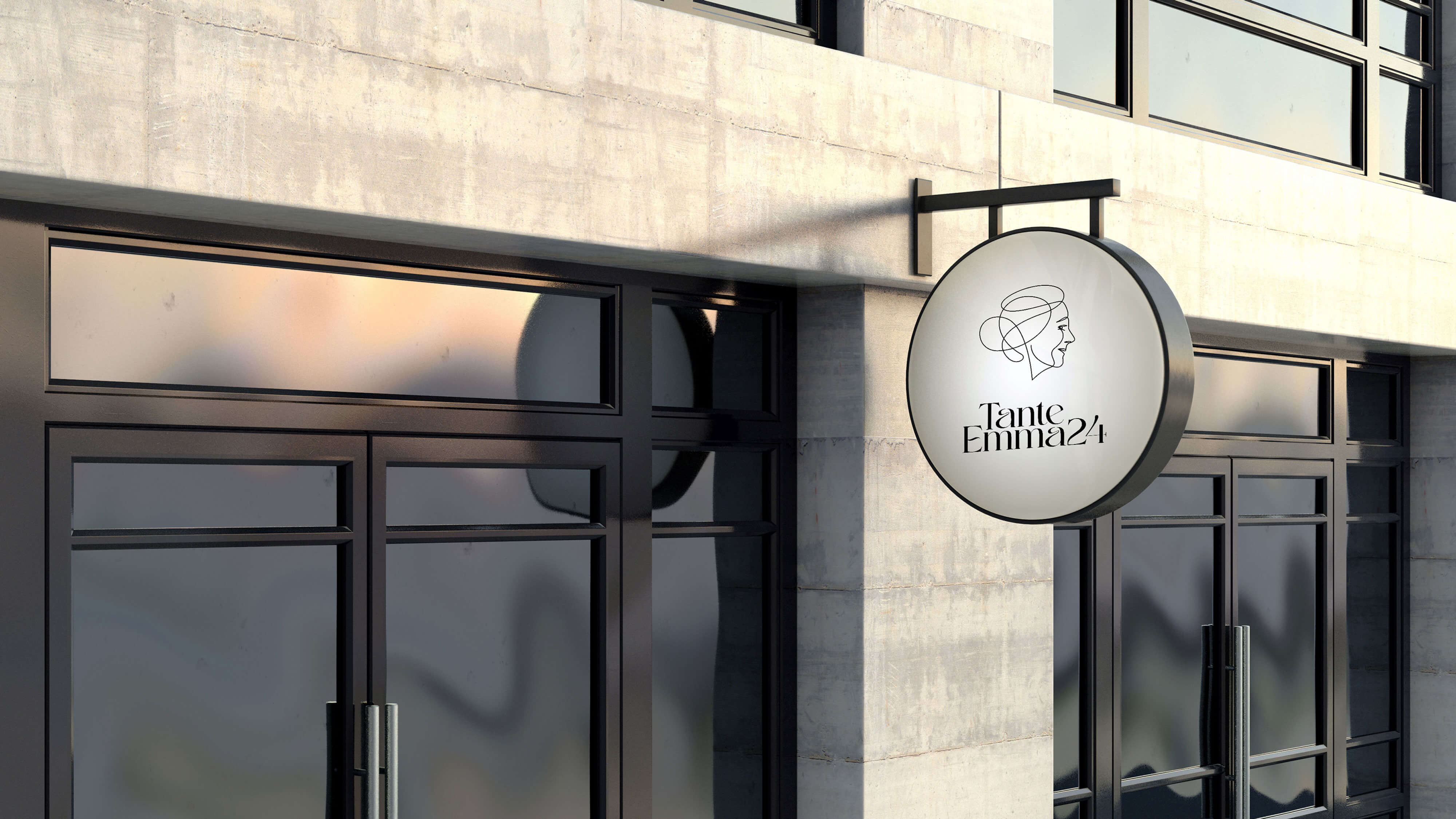
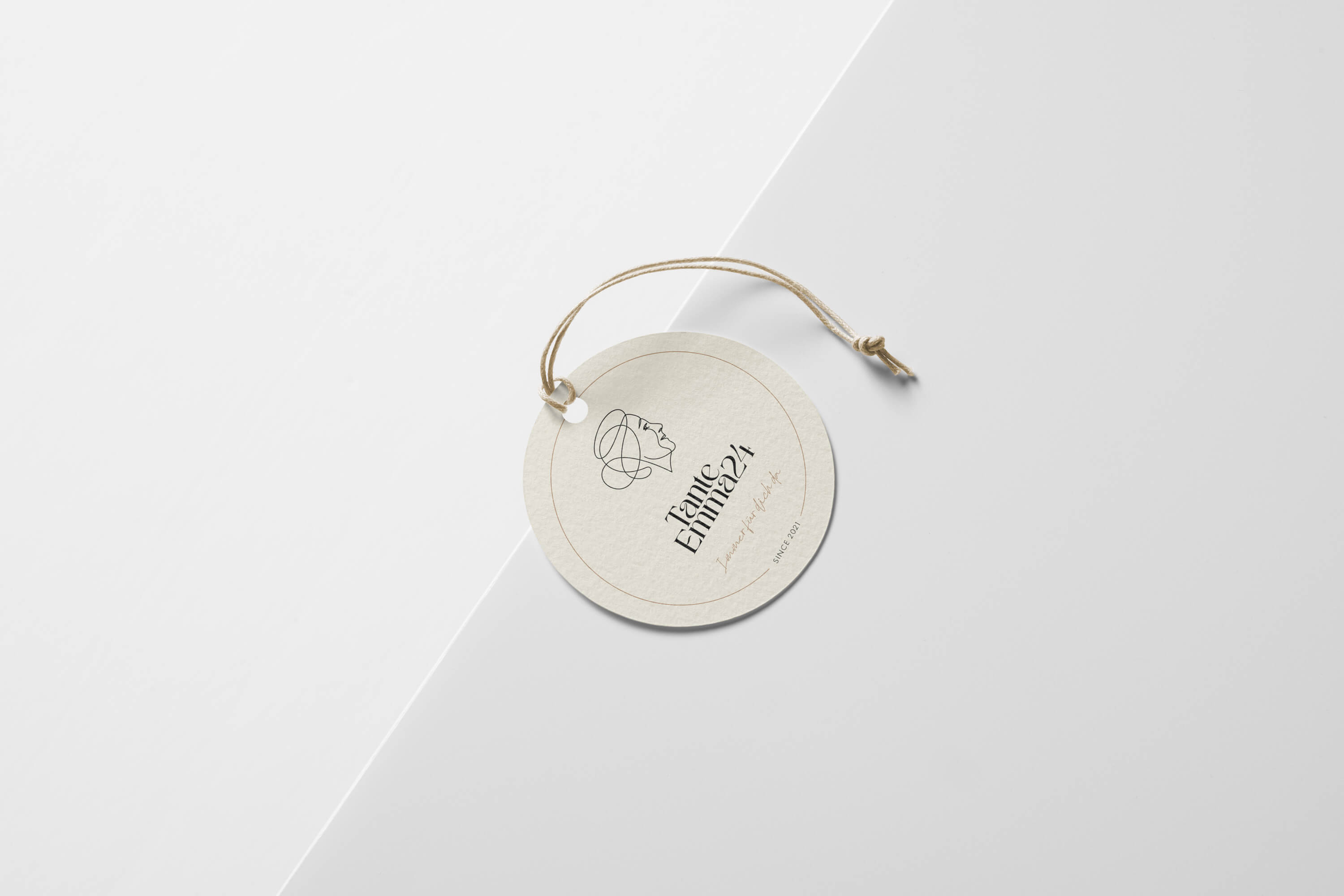
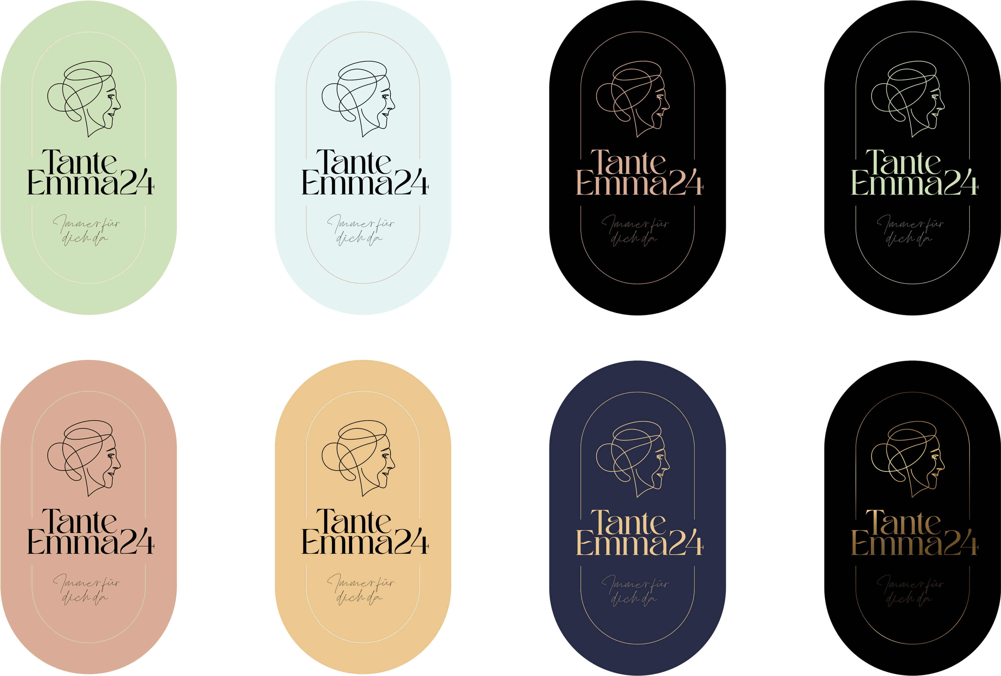
The final logo
The fine, delicate and friendly logo was designed based on the elaborated keywords and references related to different typefaces. The ultimately final signet consists of the image of a mom and pop head, which originated from a lovable and warm freehand drawing and was then digitally perfected. The associated font was finally combined in interaction with the logo and went through a long processing process.


Slogan
The courageous slogan "Always there for you" is intended to convey personal availability and proximity to a corner shop. The font "Coffekan" was selected here after long comparisons, since it represents the statement most vividly.

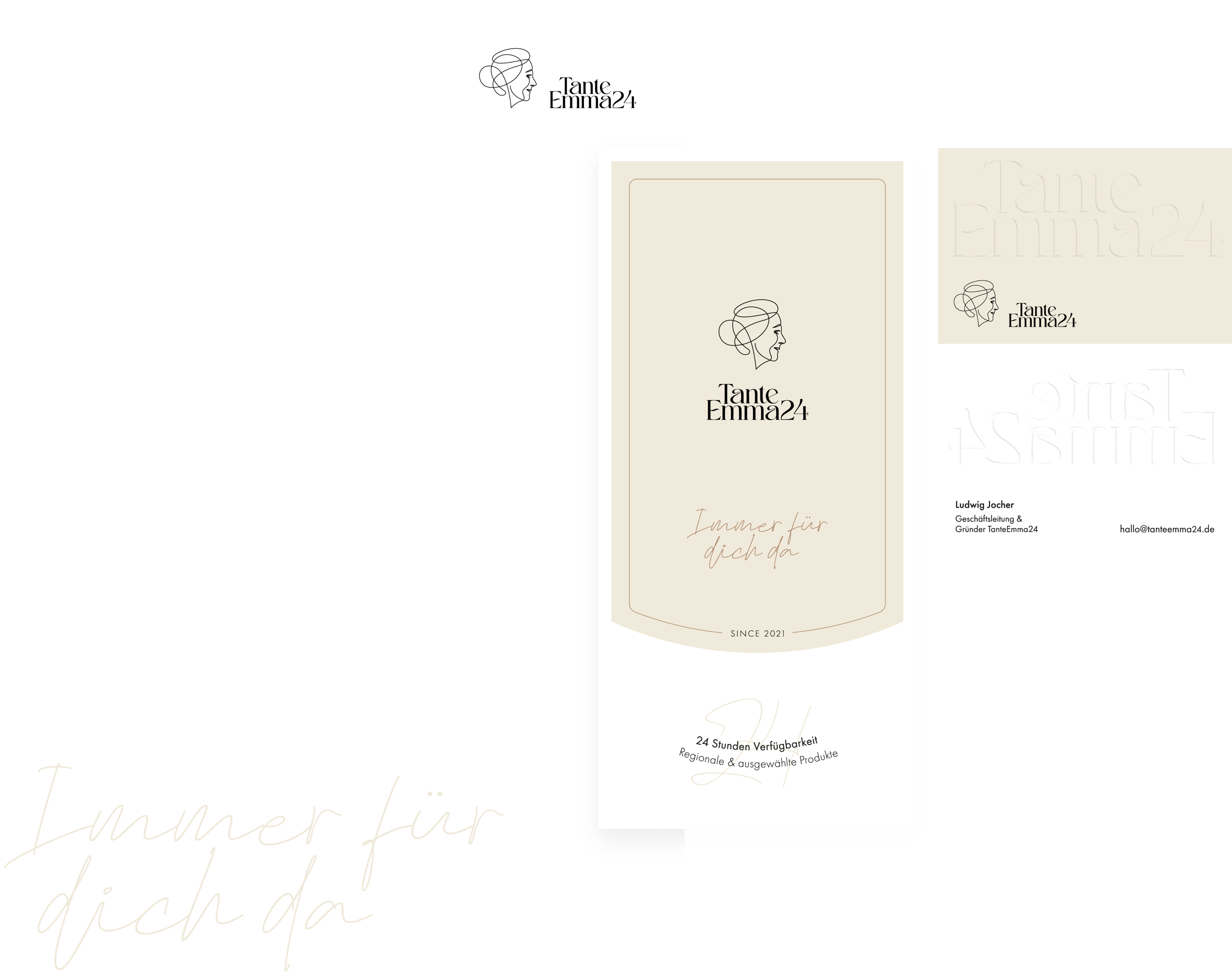
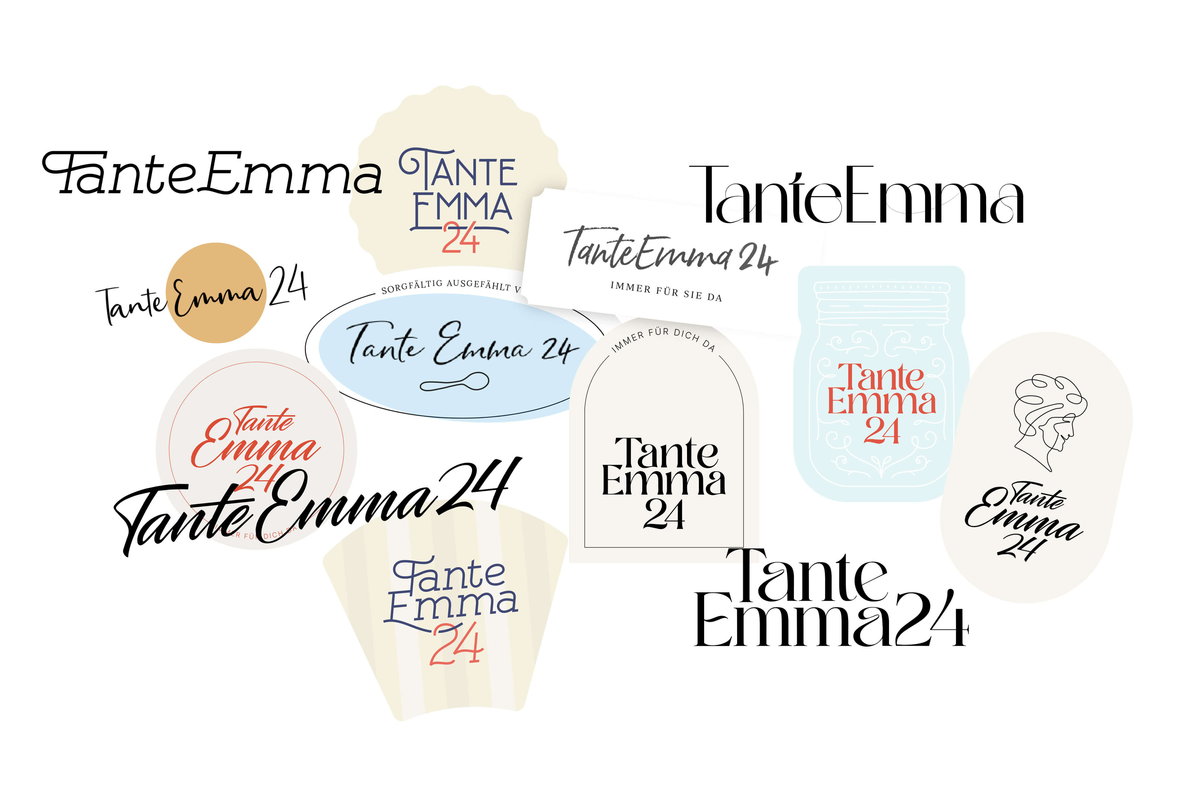
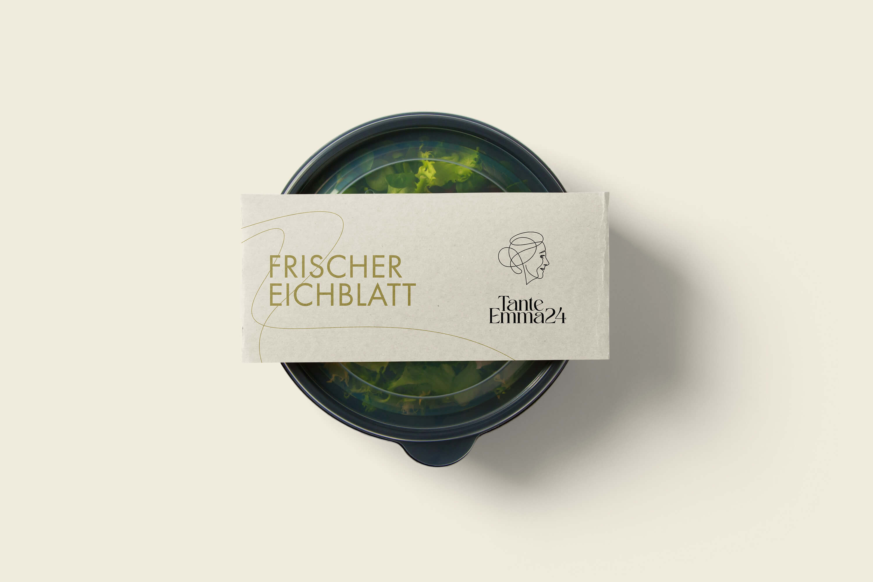
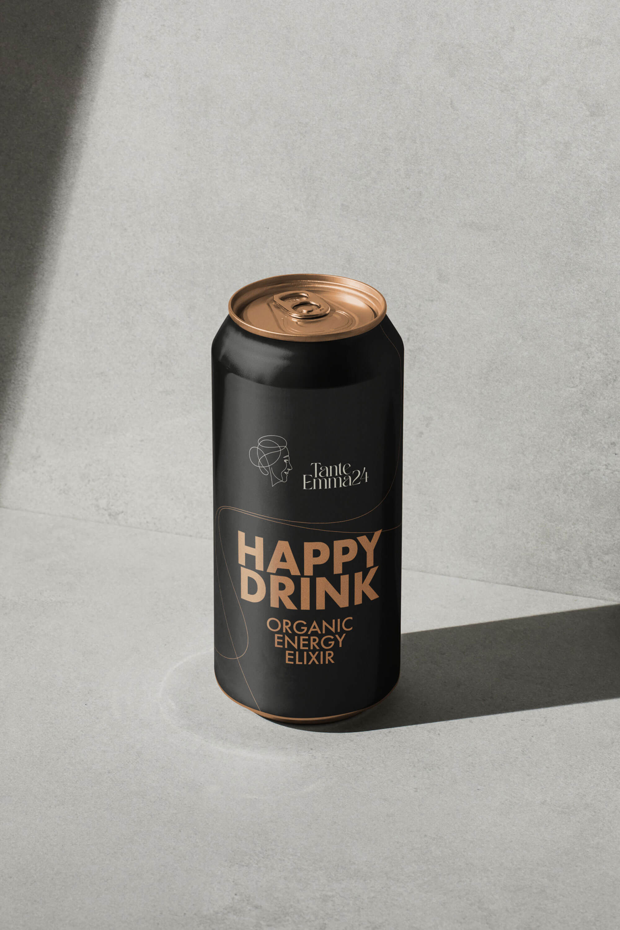
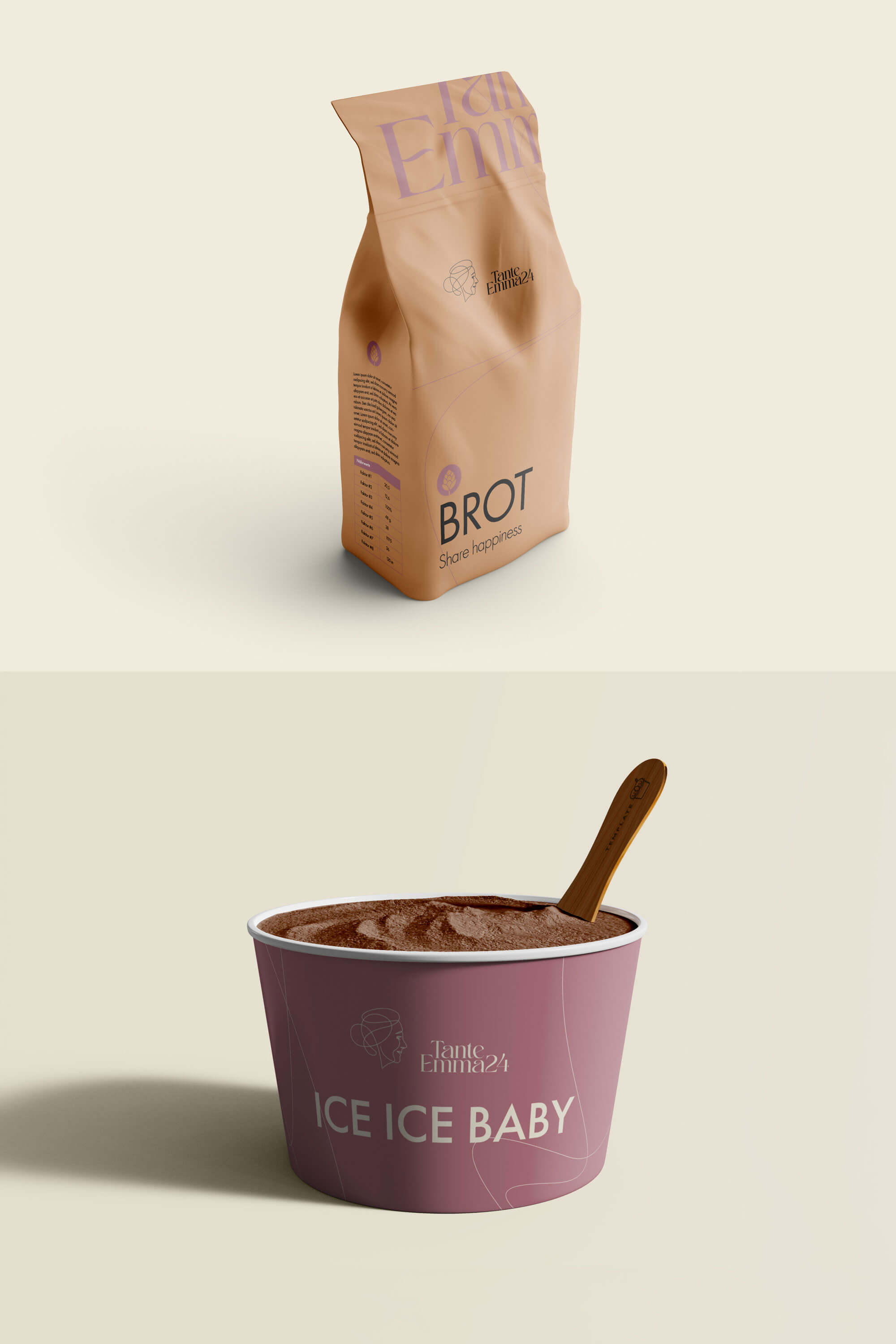
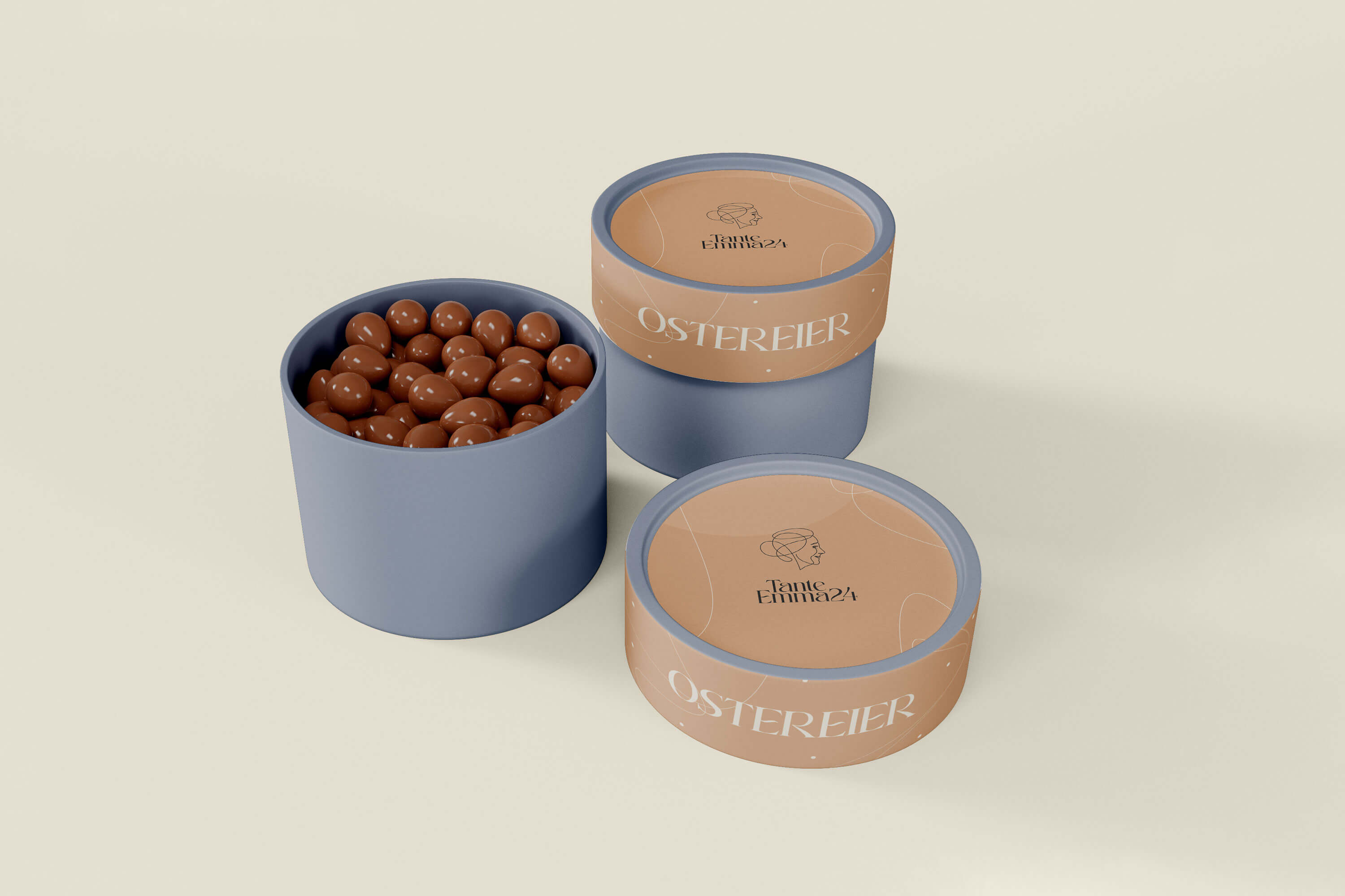
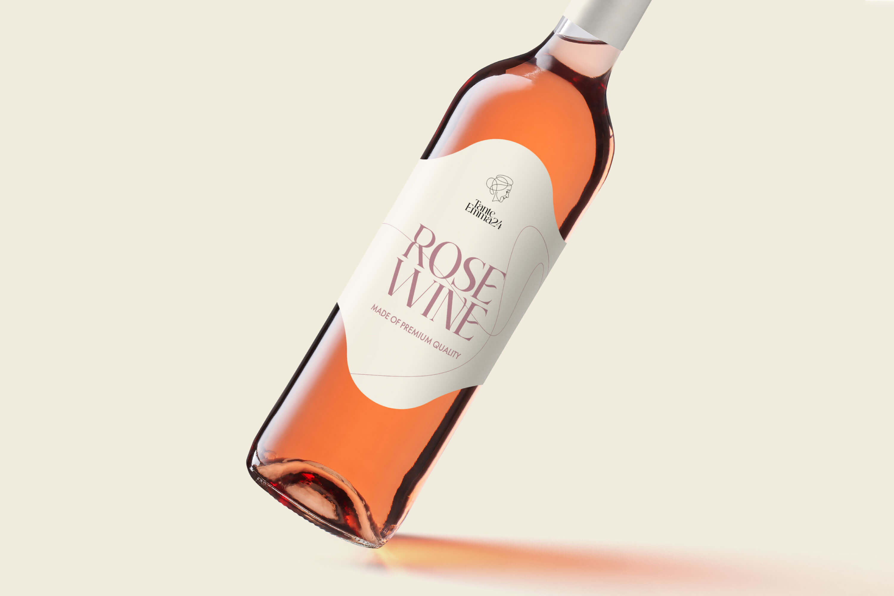
Colors and graphics
The color palette has been adapted to the respective product category and impresses with a friendly retro look. Recognition elements were used in particular in the line design and the harmonious lettering.

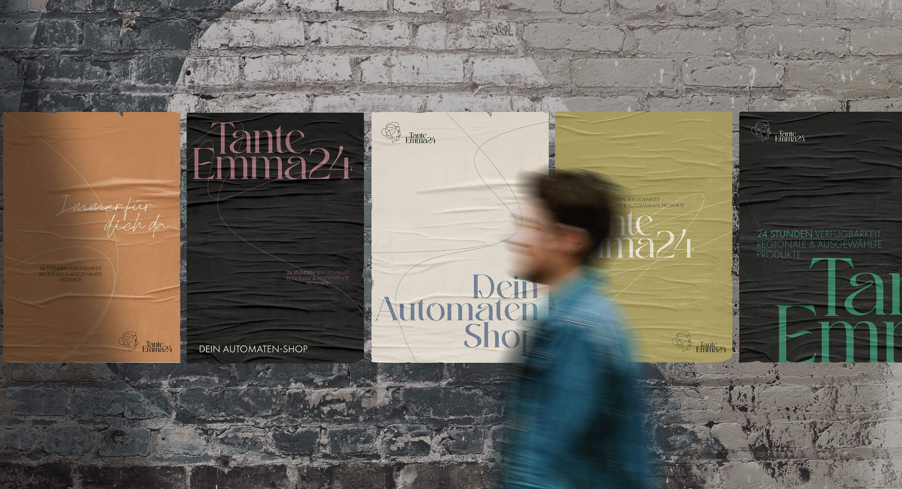

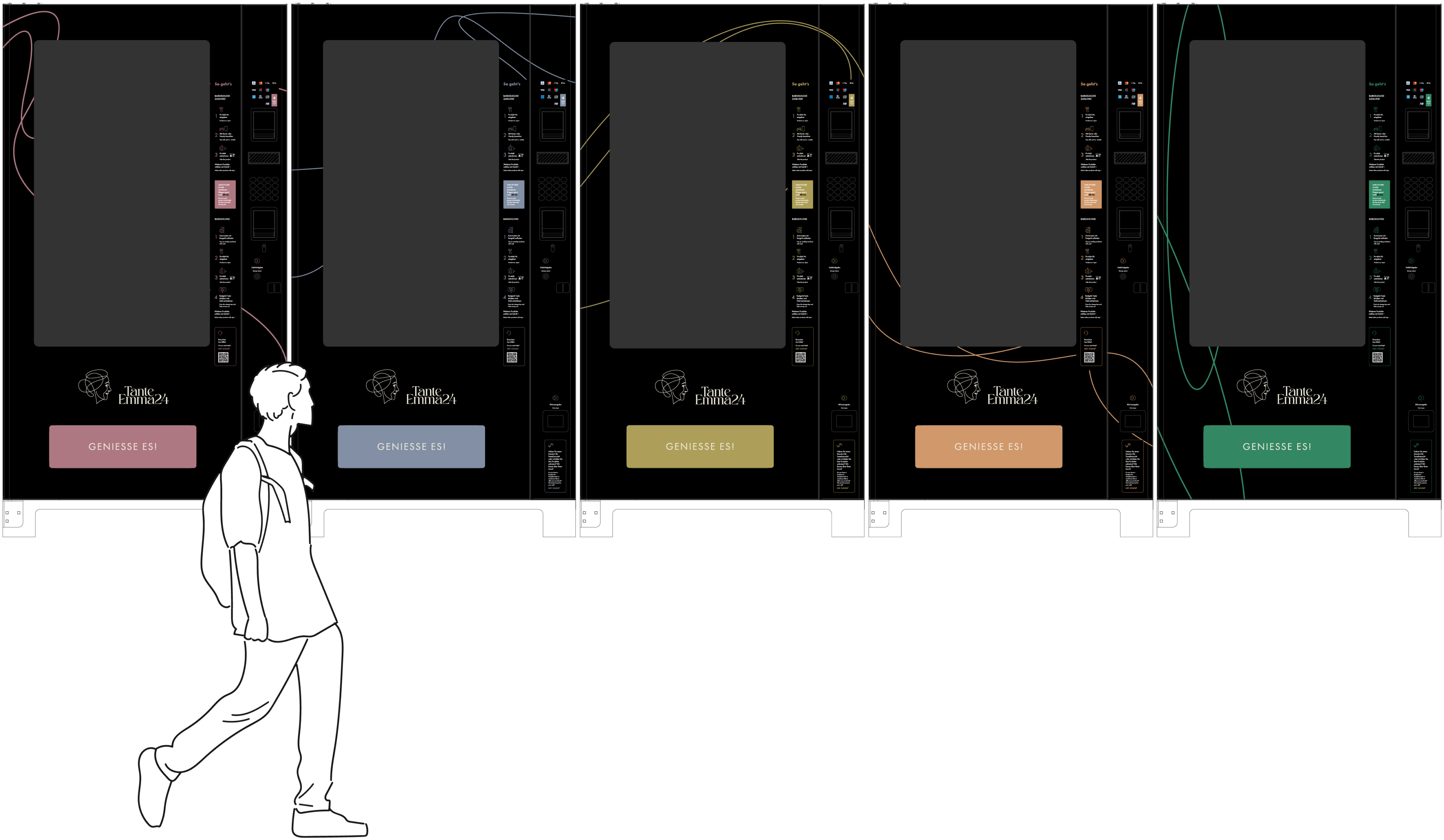
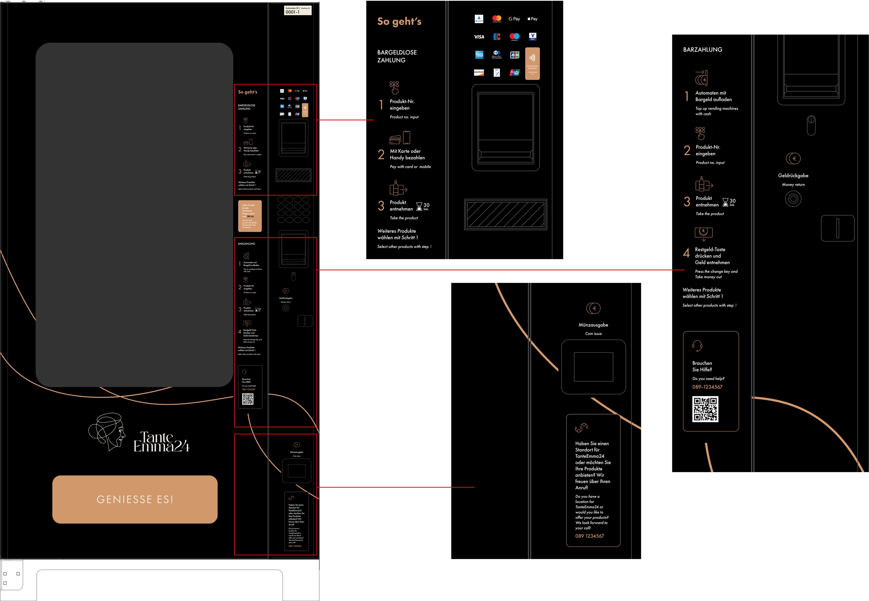
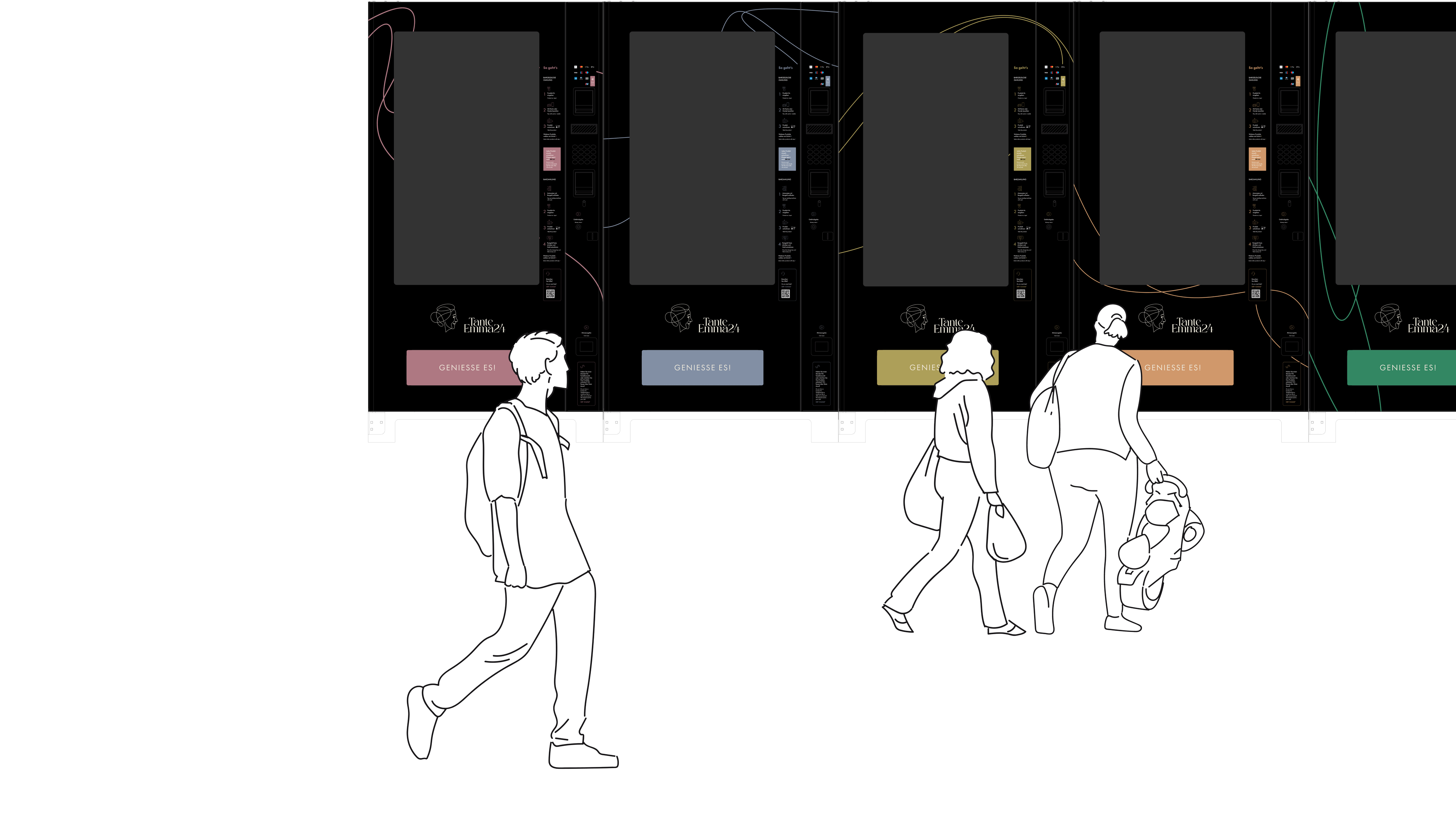
Design of the vending machines
The design of the vending machine foils was also created using graphic elements of the brand. The recognition value is strengthened by so-called key visuals of the brand. The different bright colors of the foils represent the categories of the product ranges, the strong black tone conveys quality and goodness. The filigree lines are taken from the logo details.

May we also realize your dream project?