Building a website: What you should know
The purpose of a website is to present content on the internet . When creating a website, each element used has its own effect and contributes to providing the best possible website experience. It is impossible to create a website without knowing the basic elements of a website. This blog post explains the most important elements of a website and their importance.

Basic elements
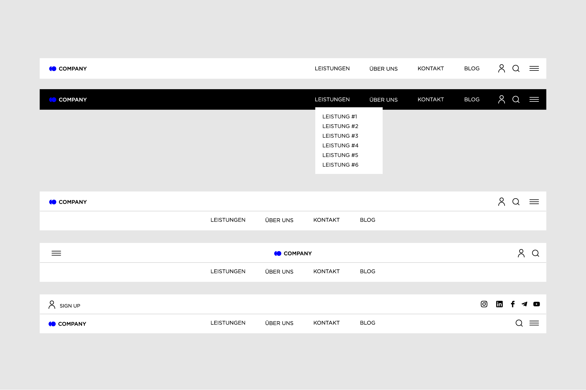
Header
The header is the top part of the website and the area that visitors see in the first few seconds of the website before they scroll down. It is therefore an element of strategic importance. The header can contain a number of useful layout elements, for example:
- Basic elements of the brand identity, usually a logo
- A call-to-action button
- Links to basic content categories
- Links to social networks
- The most important contact information (phone number, e-mail address, etc.)
- Language switching for multilingual interface
- A search field, etc.
However, this does not mean that all the elements mentioned must necessarily be included in the header. Overloading the header with information should be avoided. The more objects attract the user 's attention, the more difficult it becomes to focus on the essentials. Therefore, it is of great importance to choose carefully and only select the options that are of particular relevance to your strategy.
Hero section
The hero section is one of the largest and most important sections of a website. It is located directly below the header and is the first screen the user sees before scrolling down. The goal of the hero section is to grab the user's attention. This section should encourage the visitor to interact with the website in some way, such as watching a video, playing a game, or clicking a button to go to a specific page. Remember that the content you include in the hero section should be intuitive and visually appealing to encourage users to explore further on the website.
Main menu or menu
One of the most important navigation elements in the interface is the menu. Menus can be arranged differently in an interface as side menus, header menus, footer menus or in other forms. This allows goals to be achieved much more quickly and user needs to be satisfied.
Side menus are good for space-saving navigation structures and modern design, but may not be ideal for main navigation on small screens.
Header menus are the most common and most familiar to users. They are immediately visible and easy to design, but have space limitations and can distract from other elements in the header.

Footer menus are ideal for supplemental navigation links and displaying legal information, but require scrolling to the bottom of the page to access them.

The choice depends on the specific needs and goals of your website. In many cases, a combination of headerand footer menus is used to ensure comprehensive navigation, while side menus can be useful as secondary navigation or for specific content on mobile devices. It is advisable to consider the needs of your users and the overall design of your website to make the best choice.
Gallery
Every website needs visual elements. They make the design more interesting and help to convey the message better than text alone. However, integrating visual elements into a website can be difficult, as overloading the page with images and videos can make visitors feel overwhelmed and find it hard to focus. The result is unlikely to be satisfactory, as users can easily leave the website. For this reason, a gallery is a sure way to visually showcase the company's portfolio, products, success stories or any other type of content. There are several ways to present images: grid, carousel and slider.
Grid allows a clear arrangement of images, which makes navigation easier, but it can become confusing with a large number of images and may require scrolling, which can affect the user experience.
Carousel offers an appealing presentation of images in limited horizontal space and can be visually appealing, but users may lose focus due to automatic movements and may need to access previous images.
Slider allows space-saving display of multiple images in a limited vertical area, but it may offer more difficult navigation, especially if the display becomes too small and users need to scroll.
The choice between these options depends on the specific requirements of your website and user preferences. Depending on what content you want to present and how you want to design the user experience, one of the options may be more suitable.
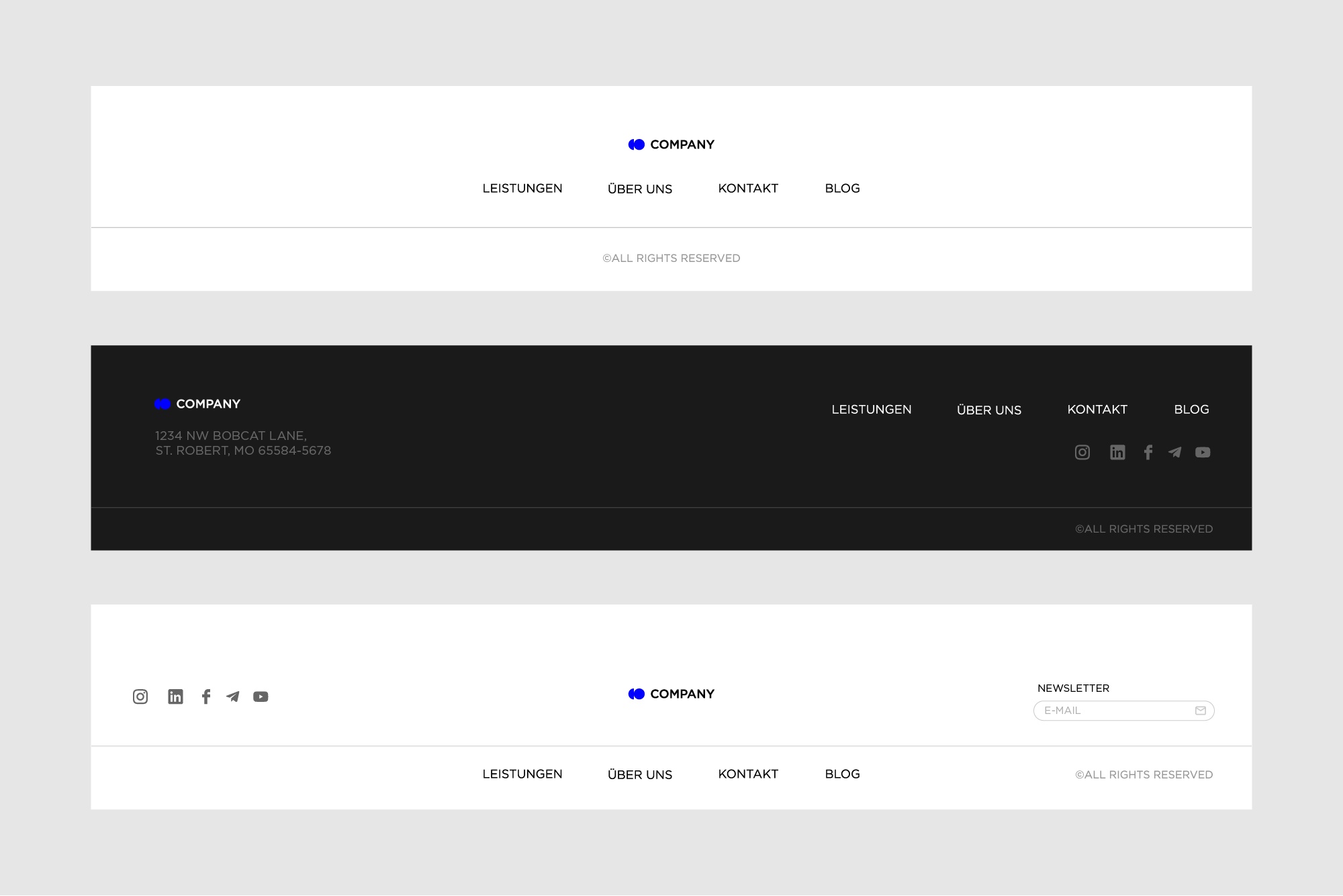
Footer
The footer is the bottom part of a web page. It usually marks the end of the web page. The footer can contain the following elements :
- Trademark, i.e. usually the name and logo of the company or product
- Links to user support areas, such as the FAQ page, About Us page, Privacy Policy, Terms and Conditions, Support Team, etc.
- Contact forms andinformation
- Social networks: links to companyor product accounts
- Subscription field orbutton etc.
CTA Buttons
The goal of every CTA is to keep a visitor on your website and ultimately turn them into a customer who buys your product or uses your service.
There are a few tips to keep in mind when creating CTA buttons :
- Choose a bold color to make the button stand out from the background.
- Describe the action clearly and concisely so that the user understands what information they will receive when they click on each button.
- Scale them so that they stand out from other content.
Form
A form is an interactive element that allows users to send information to the system or server. Since forms are the actual point of communication between the user and the digital product, they must be very simple and easy to use. Visual cues that help the user fill out the form must not be forgotten. Users frequently interact with forms in their digital lives, starting with registration, entering personal or financial information, payments, feedback, newsletter subscriptions, etc.
Breadcrumbs
Breadcrumbs are a tool for better orientation, but do not replace the primary navigation menu; they represent a secondary navigation level and increase the user-friendliness of the website if it consists of many pages. Breadcrumbs are usually located below the header and above the main content of the page.
Search
A search field, search box or search bar is an additional navigation element that you can integrate into the user interface if your website consists of many pages. The search bar is usually located in the header and helps users to get to the desired content in fewer steps by simply entering keywords to get relevant pages displayed in the search results.
Semantic HTML tags
Semantic HTML tags are tags that define the meaning of the content they contain.
By adding semantic HTML tags to your pages, you can provide additional information that helps define the roles and relative importance of different parts of your page.
For example, tags such as <header>, <article>, and <footer> are semantic HTML tags. They uniquely indicate the role of the content they contain.
<nav></nav>
<header></header>
<main></main>
<article></article>
<section></section>
<footer></footer>
On the other hand, tags such as <div> and <span> are typical examples of non-semantic HTML elements. They serve only as a carrier for the content, but give no indication of the nature of the content or the role that content plays on the page.
<div class="nav"></div>
<div class="header"></div>
<div class="main"></div>
<div class="article"></div>
<div class="section"></div>
<div class="footer"></div>
Non-semantic tags are not recommended when creating a website for several reasons:
- Lack of structure
Non-semantic tags do not provide a clear structure and meaning for the content of the website, resulting in an unstructured and difficult to understand layout. - Accessibility
Accessibility is an essential aspect of web design. Non-semantic tags make it difficult for people with disabilities to use screen readers and other assistive technologies because they do not provide meaningful information about the content. - Search engine optimization (SEO)
Search engines often rate websites with non-semantic tags negatively, as they do not clearly understand the content and may therefore rank the page lower in the search results. - Development and maintenance
The use of non-semantic tags can make the development and maintenance of a website more complicated and error-prone, as they do not provide clear instructions for the structure of the page. - Consistency
Non-semantic tags often lead to inconsistent design and behavior on the website, which can negatively impact the user experience. - Future-proof
Non-semantic tags are less well prepared for future developments and technologies as they do not define clear meanings for the content of the page
Conclusion
When working on a website, it's important that you stick to the structure listed in order to have an effective website. Thorough user research will help you identify the sections that your website needs to provide a successful user experience. Each of these elements can contribute to the success of your business or, if poorly implemented, failure, so it pays to have a basic understanding of the anatomy of a website and the importance of its elements.


