
Grid vs. Flex in Responsive Design
It is of great importance for every company that its content is presented optimally. The responsibility for this lies in the CSS code . CSS has always been one of the most important parts of web development . A few years ago, creating website layouts was very time consuming. We tried to create a responsive website through CSS properties like float, positioning of many elements and position and inline block styling.
Nowadays this is much easier to do by using two CSS layout systems : Flexbox and CSS Grid . This blog post discusses when to use Flexbox and when to use CSS Grid .
What does Grid mean?
CSS Grid is a two-dimensional layout system . It can be worked with rows and columns, which means there are many different ways to create complex and organized design systems .
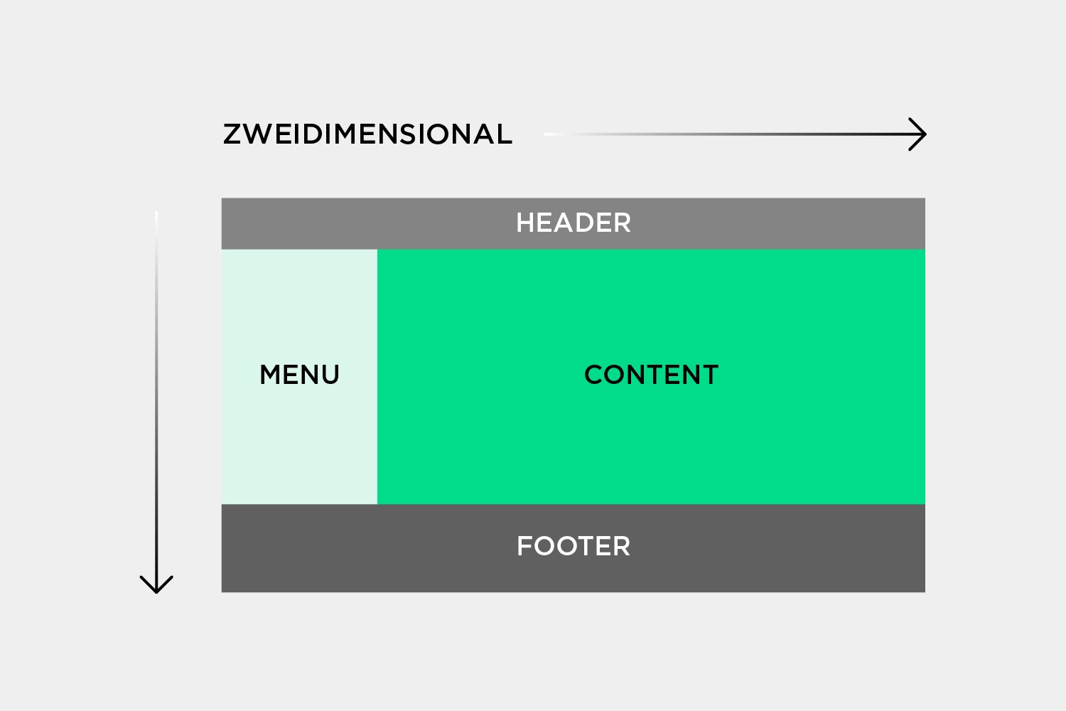
This is a significant relief as there is no need to use element positioning methods or floats as was the case in the past.
Let's look at the HTML snippet and consider how to create a layout from it.
<div class="container">
<div id="one">Eins</div>
<div id="two">Zwei</div>
<div id="three">Drei</div>
<div id="four">Vier</div>
<div id="five">Fünf</div>
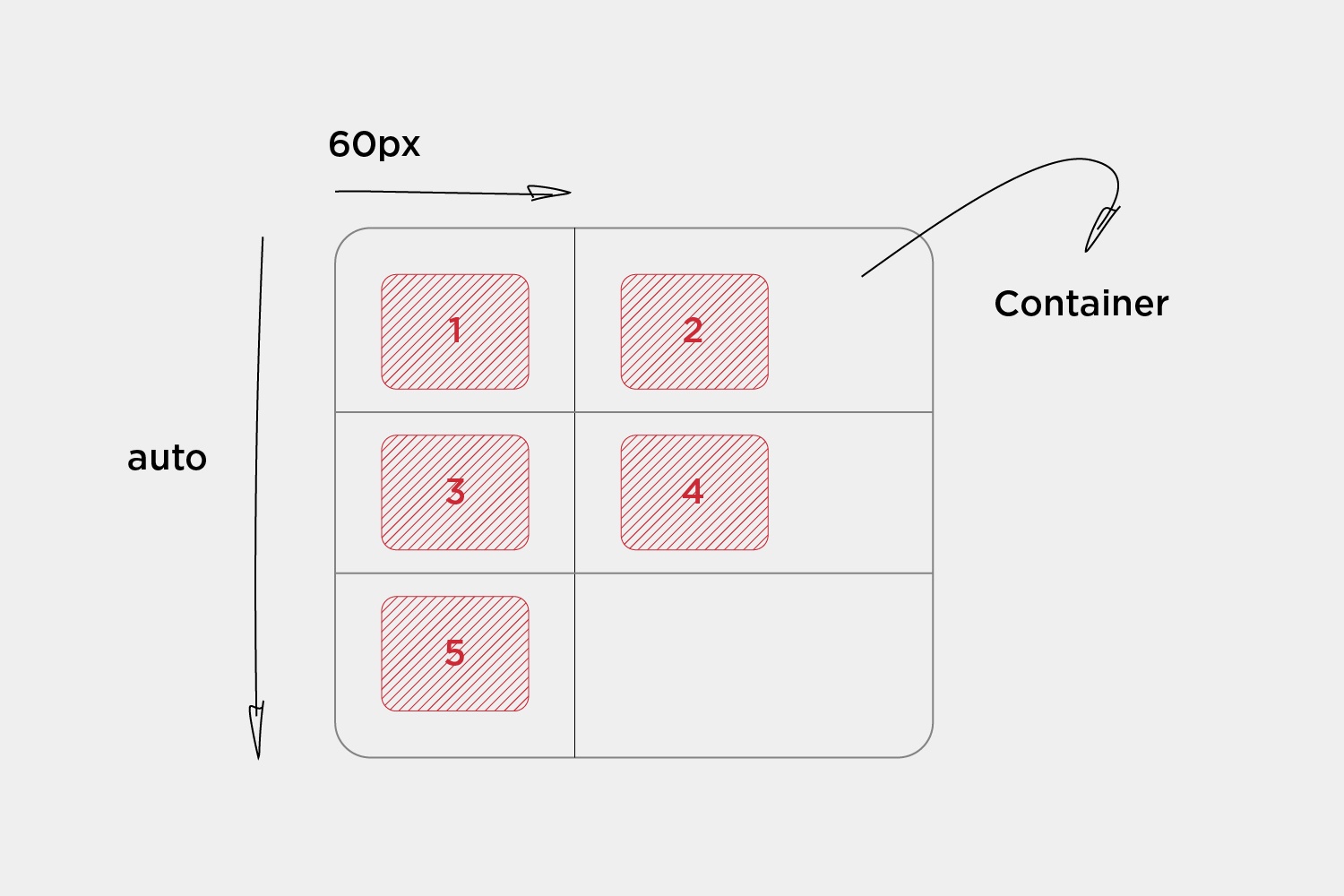
</div>To define a grid container , the container must be assigned the "display: grid" property. Then the number of rows and columns can be specified by the properties "grid-template-rows" and "grid-template-columns" . The values passed determine how far the grid elements extend within the container.
grid-template-columns: 60px 60px;
grid-template-rows: auto;
From the code written, you can see that the layout is set to two columns, each taking up 60 pixels of the container. Since there are five elements, the "auto" attribute results in three columns that span the entire container.
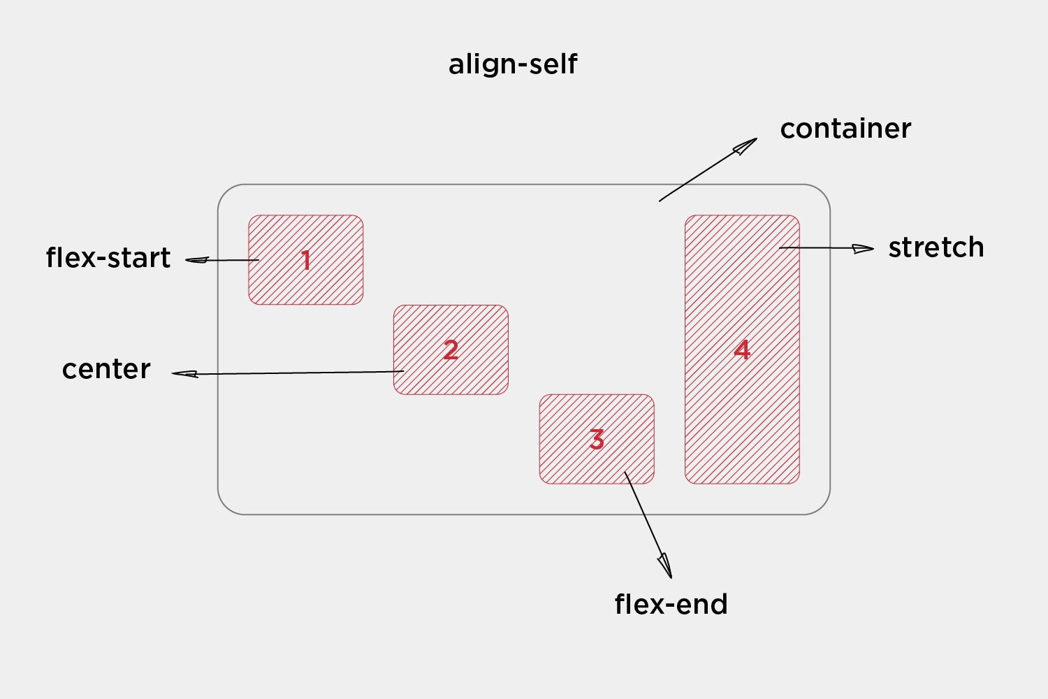
Alignment of elements
Another advantage of Grid is the easy way to align the elements within the Grid container . An element in the grid can be aligned along the inline axis (row direction) using "justify-self" . In contrast, "align-self" is used to define an alignment along the block axis (column direction).
Values:
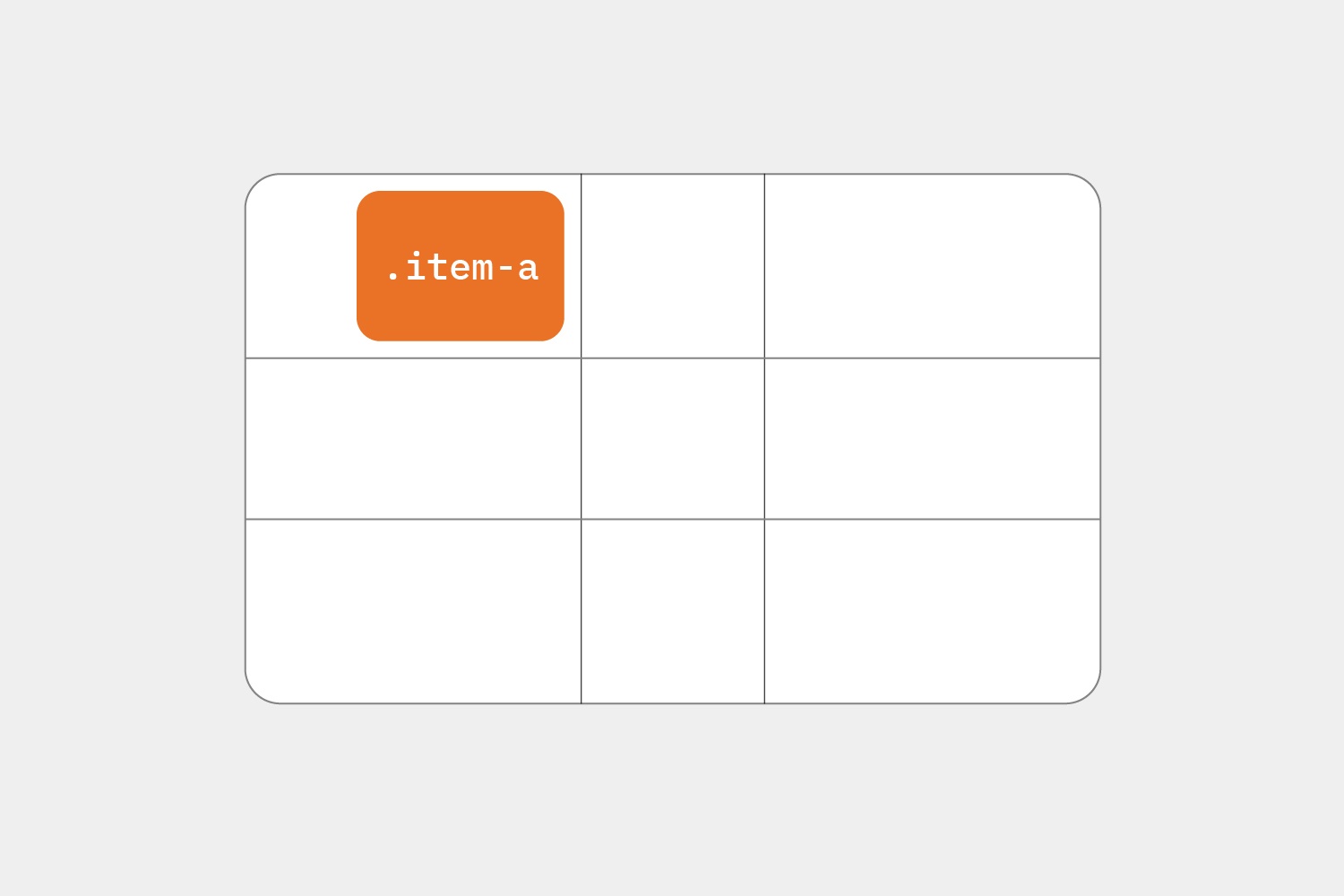
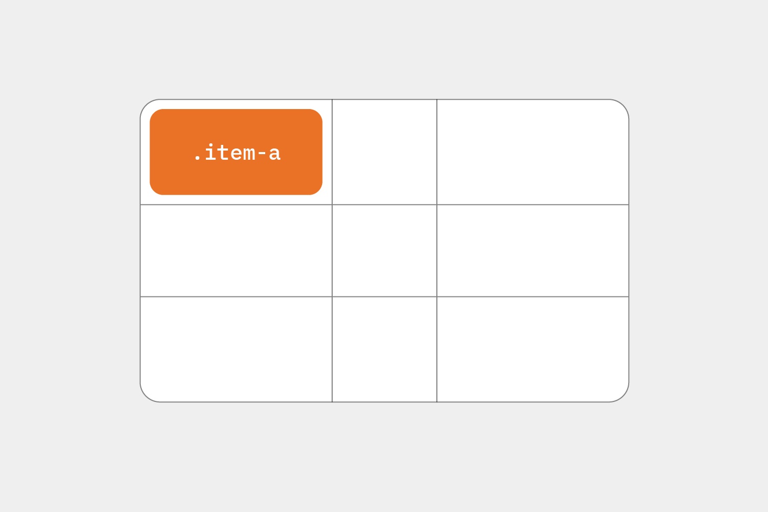
.item {
     justify-self: start | end | center | stretch;
}
Examples:
.item-a {
     justify-self: start;
}
.item-a {
     justify-self: end;
}
.item-a {
     justify-self: center;
}
.item-a {
     justify-self: stretch;
}
Of course there are other properties in the grid . Justify content, Justify items, Align items can also be used. The grid offers a great deal of flexibility in aligning and creating complex layouts .
What does flex mean?
Flexbox is a one-dimensional layout system that can be used to create a row or column axis layout .
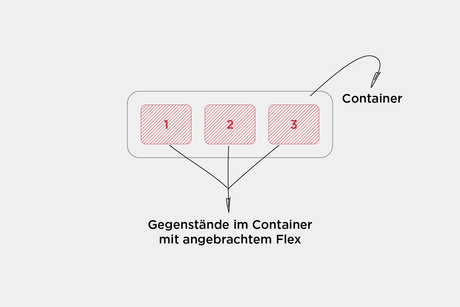
All that needs to be done is to create a flex container with the display: flex property. After that, every item that is in that flex container becomes a flex item .
The corresponding code would be the following:
<div class="container">
     <div id="one">1</div>
     <div id="two">2</div>
     <div id="three">3</div>
</div>
.container {
display: flex;
}
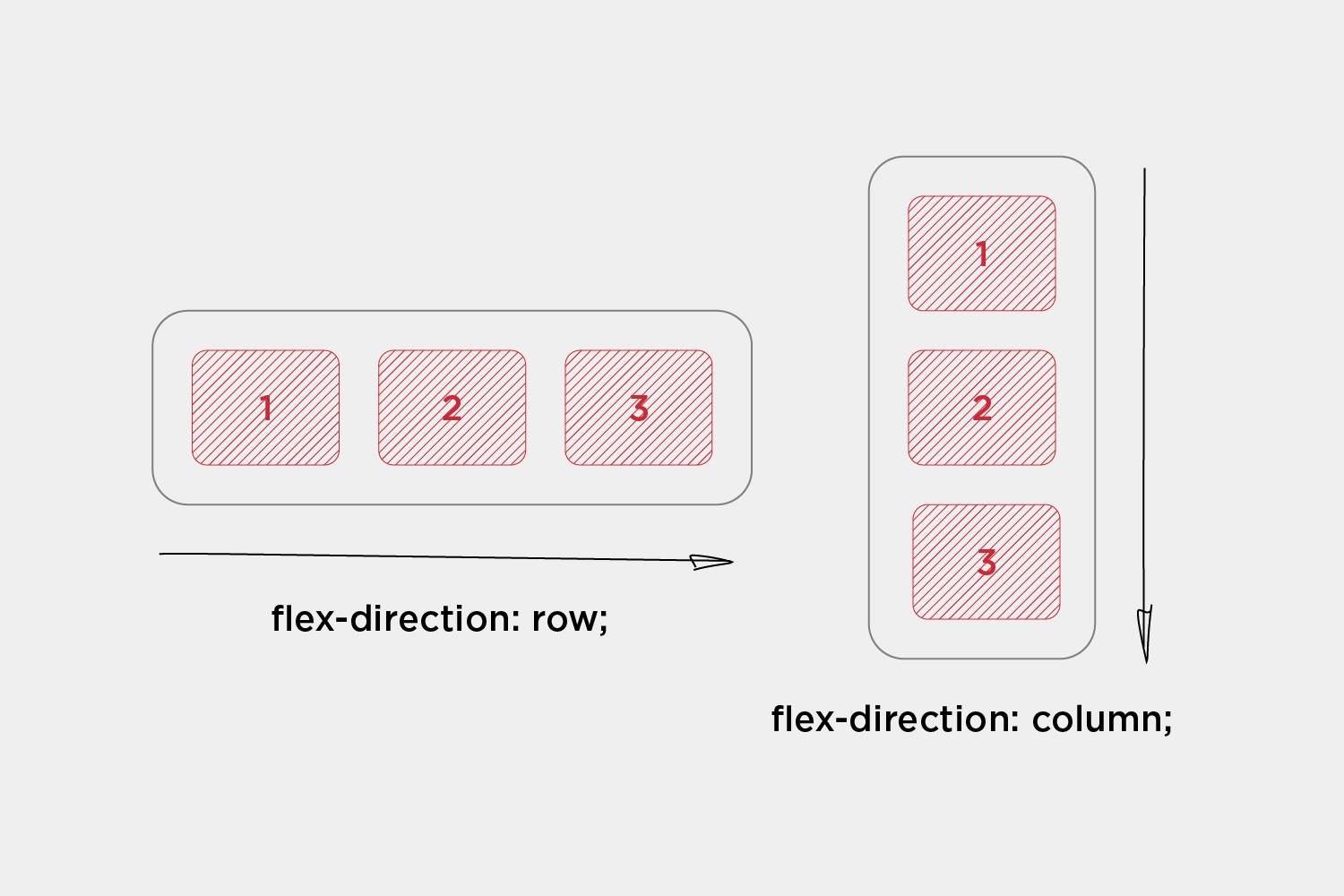
In a flex container, the direction for the items in the container can be set. The most commonly used flex directions are row and column.
.container {
     flex-direction: row | column;
}
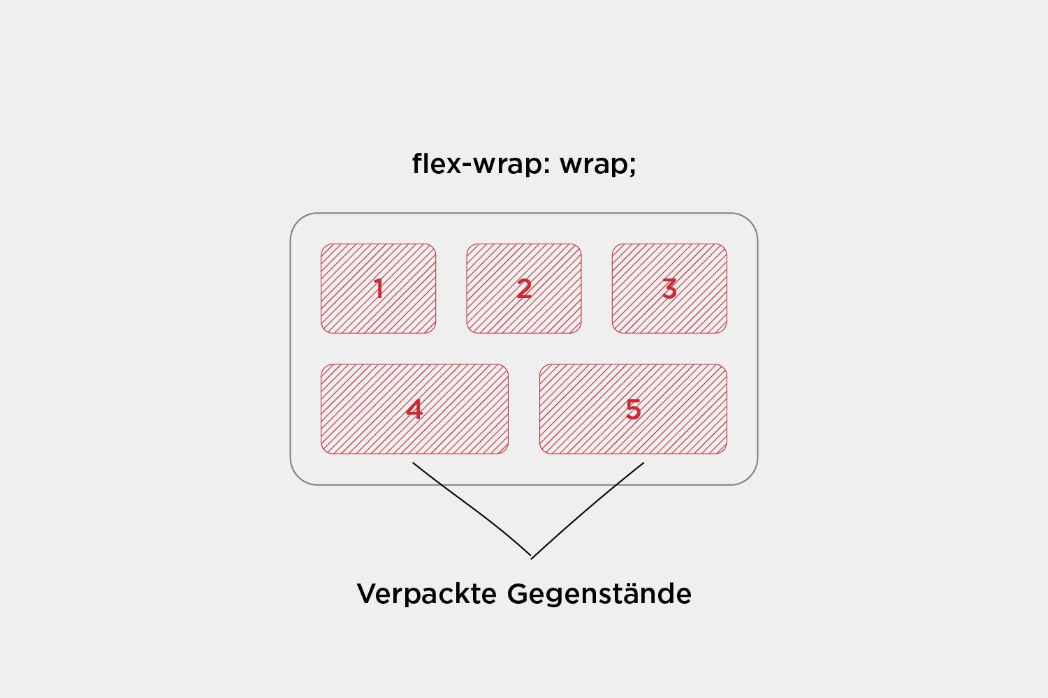
Another interesting property is flex-wrap , which allows items in a flex container to be moved to the next row when there is no more space:
.container {
     flex-wrap: wrap| nowrap | wrap-reverse;
}
Alignment of elements
Alignment of elements is also what makes Flex powerful.
#one {
     align-self: flex-start | flex-end | center | stretch;
}
For example, instead of aligning each individual item, all items within the container can be aligned together. For this, "justify-content" . Here is an example with three elements:
.container {
     justify-content: flex-start | flex-end | center | space-between | space-around;
}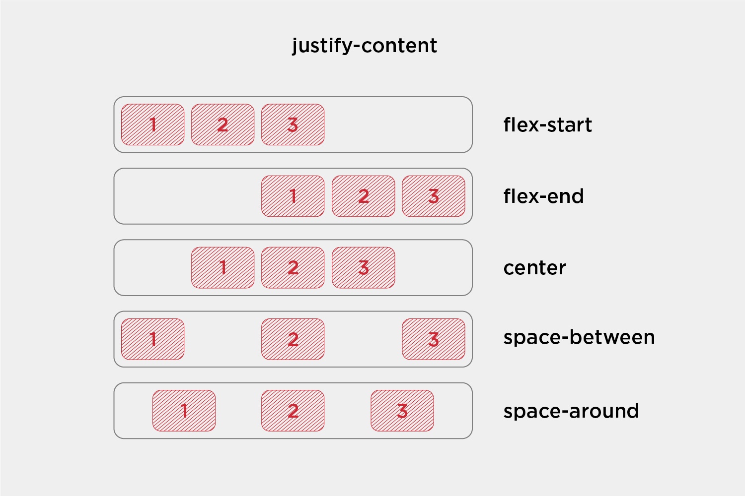
It's really easy to align content inside Flex containers .
What is the difference between Grid and Flex?
Now that the features of the two variants are clear, the differences as well as the best use cases for each tool can be highlighted.
-
dimensionality and flexibility
The main difference between the two is the dimensionality offered.
CSS Grid provides two-dimensional layout features that allow elements to be arranged horizontally and vertically. On the other hand, CSS Flexbox offers flexibility and allows elements to be placed either horizontally or vertically on a single axis. With these tools, developers can create complicated, responsive web designs that offer very good dimensionality and flexibility.
CSS Grid is a two-dimensional layout system that allows users to design and create structures that would not be possible with traditional HTML and CSS . On the other hand, CSS Flexbox is a one-dimensional layout system that offers users the ability to structure their web designs in a more dynamic and responsive way than ever before. - alignment
When using CSS Grid, elements are positioned using numeric coordinates, while Flexbox uses relative positioning and margins. This makes it easier to adjust the dimensions of individual elements when using Flexbox . - positioning and sorting
When it comes to displaying one-dimensional or two-dimensional lists, flexbox and grid both have their advantages. Flexbox makes it easier to manipulate the size and position of elements and change the order of content on the page. On the other hand, a grid provides a powerful way to create structured layouts using numerical coordinates and allows for more precise placement of elements in a two-dimensional space. Ultimately, the decision between CSS Grid and CSS Flexbox depends on the needs of a specific project and the desired outcome.
Grid allows for locating elements by numerical coordinates, allowing for easy reordering by changing those coordinates. In addition, elements can be quickly and easily adjusted in size and position. In contrast, Flexbox is more difficult to manage because elements are placed relative to each other and borders must be adjusted to change layouts.
Is flexbox or grid more suitable?
For a web layout that consists of only rows or columns, flexbox is the best model. However, for a complex, multi-row and multi-column layout , you should use CSS Grid . Grid is best suited for two-dimensional layouts with many elements that need precise positioning relative to one another. Flexbox is better suited for one-dimensional or one-line layouts , where you only need to place a set of elements in a specific way.
Grid and Flex together?
Both layout models can also be used together. You don't necessarily have to choose between CSS Grid or Flexbox . You may want to style your entire web layout with CSS Grid , but use Flexbox for certain parts of your website . They both solve layout problems in different ways, and there's no reason why both models can't work in complementary ways to create the website you want.
Interesting examples
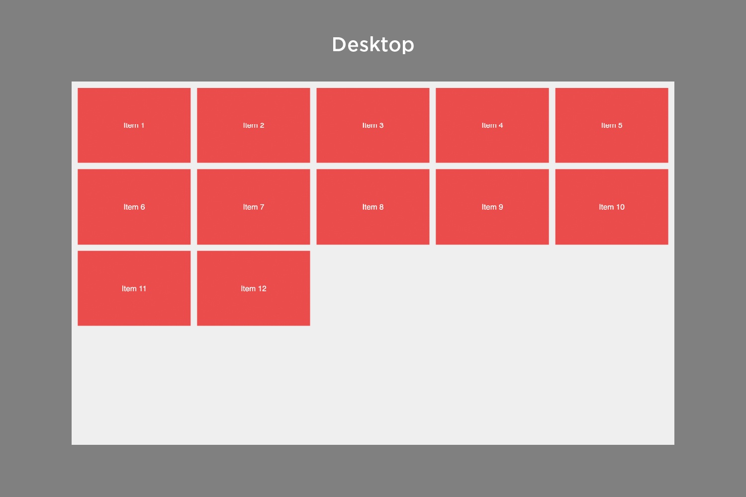
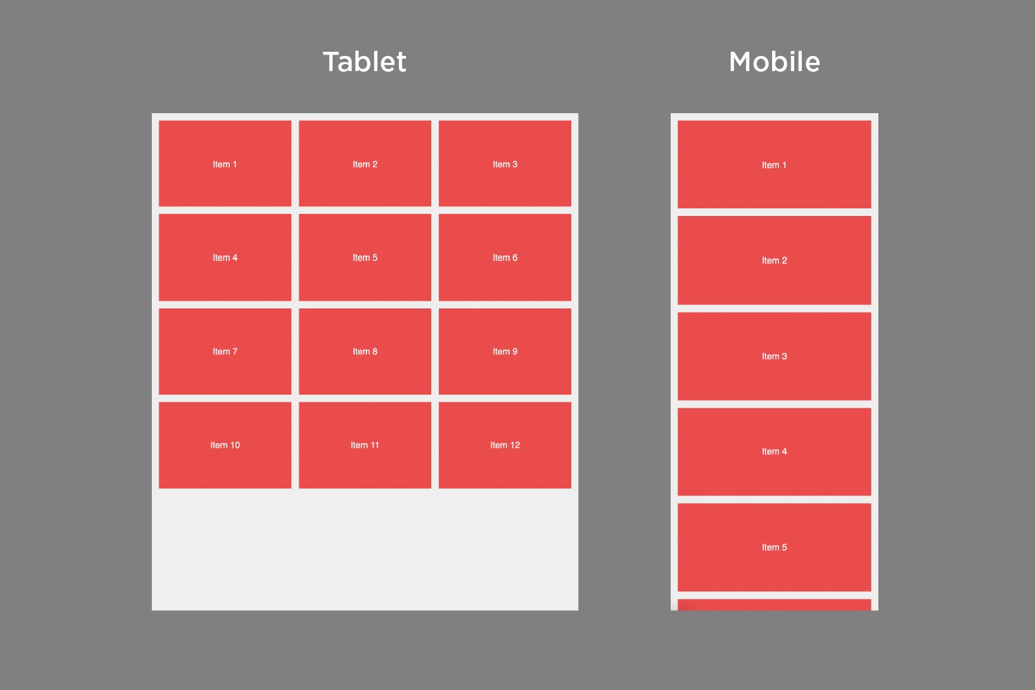
Responsive design with grid without media queries
Below is an example showing how to create a responsive grid layout without any media queries . It dynamically adjusts to the size of the browser window and displays a random arrangement of elements.
Set the minimum element size with "--auto-grid-min-size" and you'll get a fully responsive grid with no media queries . The corresponding code would be the following:
<ul class="auto-grid">
  <li>Item 1</li>
  <li>Item 2</li>
  <li>Item 3</li>
  <li>Item 4</li>
  <li>Item 5</li>
  <li>Item 6</li>
  <li>Item 7</li>
  <li>Item 8</li>
  <li>Item 9</li>
  <li>Item 10</li>
  <li>Item 11</li>
  <li>Item 12</li>
</ul>
.auto-grid {
--auto-grid-min-size: 18rem;
display: grid;
grid-template-columns: repeat(auto-fill, minmax(var(--auto-grid-min-size), 1fr));
grid-gap: 1rem;
}
body {
background: #efefef;
padding: 1rem;
line-height: 1.4;
font-family: sans-serif;
}
li {
padding: 5rem 1rem;
text-align: center;
font-size: 1.2rem;
background: #eb4d4b;
color: #ffffff;
}This illustrates that it is not necessary to write many media queries to change the number of columns in a grid .
The result as it actually looks on larger or smaller screens:
Browser support
Conclusion
CSS Grid allows you to design the outer layout of your website . With it you can create complex and responsive designs , which is why it is called “layout first” . Flexbox, on the other hand, is more suitable for aligning content and moving blocks.
CSS grids are great for creating 2D layouts and can be used with both rows and columns. Flexbox, on the other hand, only works in one dimension (either rows or columns).
Therefore, it can be time-saving and helpful to use both models at the same time to achieve the desired layout .

With a market share of over 64% , WordPress is the most widely used content management system (CMS) in the world . The reasons for this are obvious, as on the one hand it is very easy to install and operate, and on the other hand it has enormous versatility. Precisely because WordPress is so widespread, many users very often resort to so-called purchased templates or WordPress themes . At first glance, themes look good - but what happens if they have to be expanded with some individual requirements, or if a major update is imminent? In this article, we want to draw your attention to the problems with purchased WordPress templates/themes and why you should plan a professional WordPress website properly.
Newsletter
We keep you up to date on online marketing, development and design topics. Short and to the point, but with exciting content to apply and share with the team.
